
"Discover. Dream. Do."
My Role
Logo Design
Brand Strategy
The Team
Mae Belkadi, Kacey Chen,
Farisa Alam, Angelo Torres
Tools
Figma, Illustrator, Photoshop,
After Effects
Duration
4 Months
Brand Profile
Problem
Liberty Science Center struggles to balance its family image with reaching a wider audience. Its brand lacks the polish and inclusivity needed to be seen as a space for learning, innovation, and community.
Solution
A rebrand that positions LSC as a vibrant and welcoming space for everyone. Updating its visual identity shows innovation and inclusivity, while keeping the brand’s friendly vibe.
Brand Mission
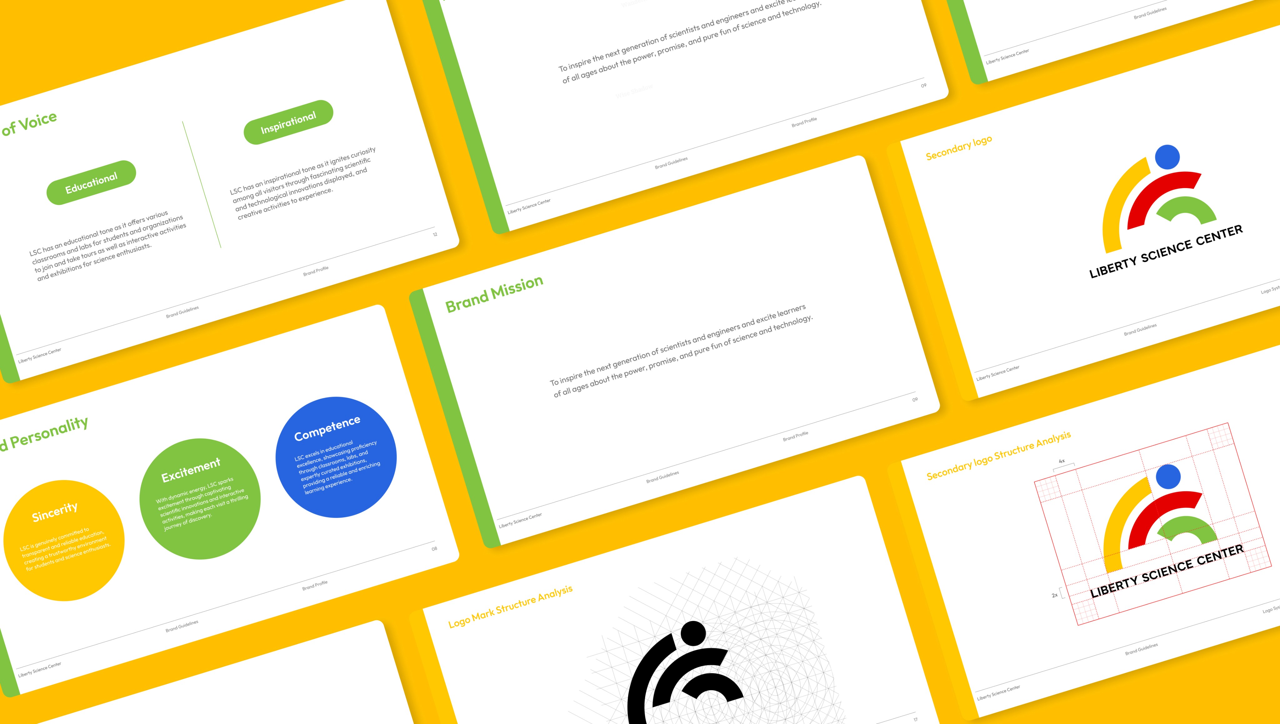
To inspire the next generation of scientists and engineers and excite learners of all ages about the power, promise, and
pure fun of science and technology.
Brand Archetypes
The Explorer
65%
The Sage
35%
Brand Archetypes
Tone Of Voice
Sincerity : Committed to transparent and reliable education, creating a trustworthy environment for science enthusiasts.
Excitement : Through captivating scientific innovations and interactive activities, making each visit a thrilling journey.
Competence: Showcasing proficiency through classes, labs, expertly curated exhibitions, and enriching learning experience.
Educational
Inspirational
Brand Identity
Master Brand Identity
Our logo design is inspired by the captivating world of Alexander Calder's mobiles, where the balance and movement of suspended elements create a mesmerizing visual experience. At its core, the concept fuses Calder's mobiles with the fundamental principles of balance found in seesaws.
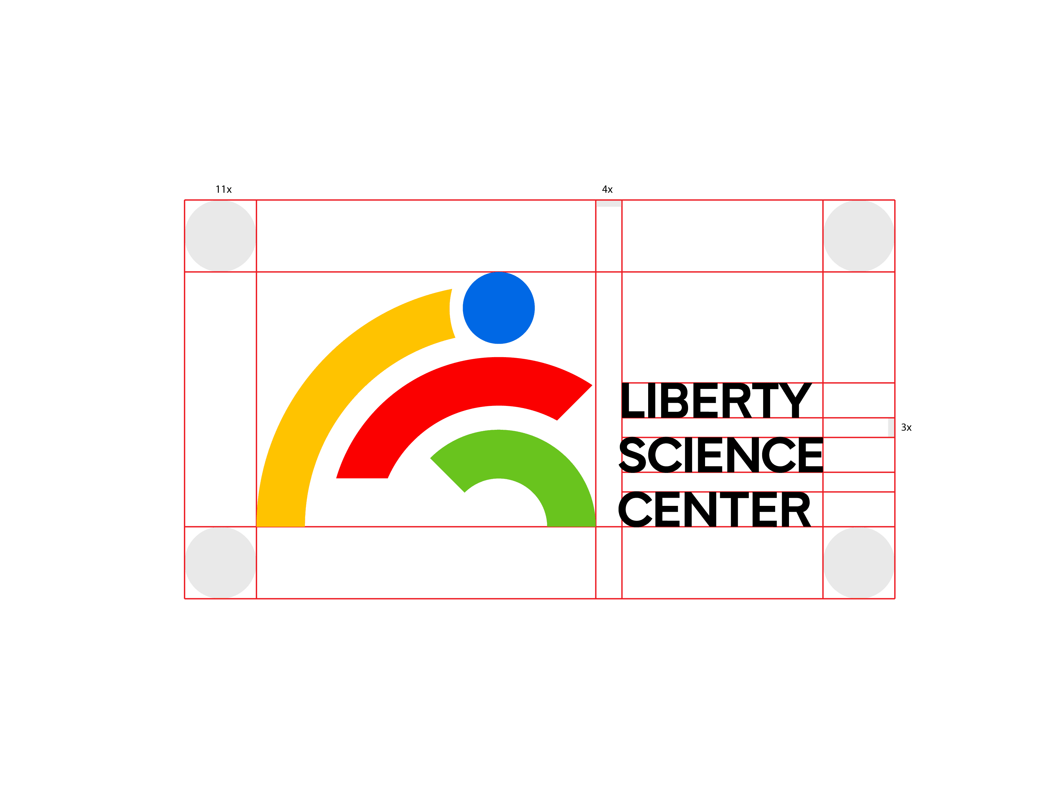
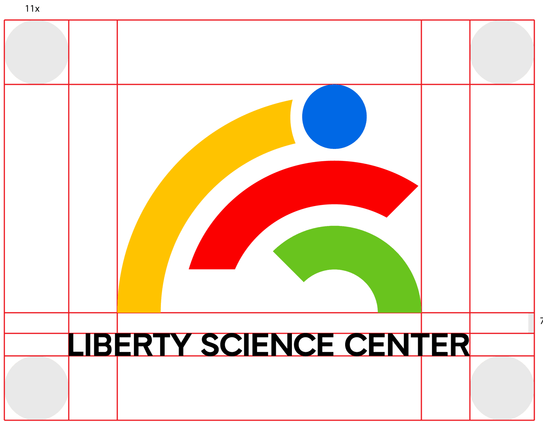
Structural Analysis & Area of Isolation
Secondary Logo
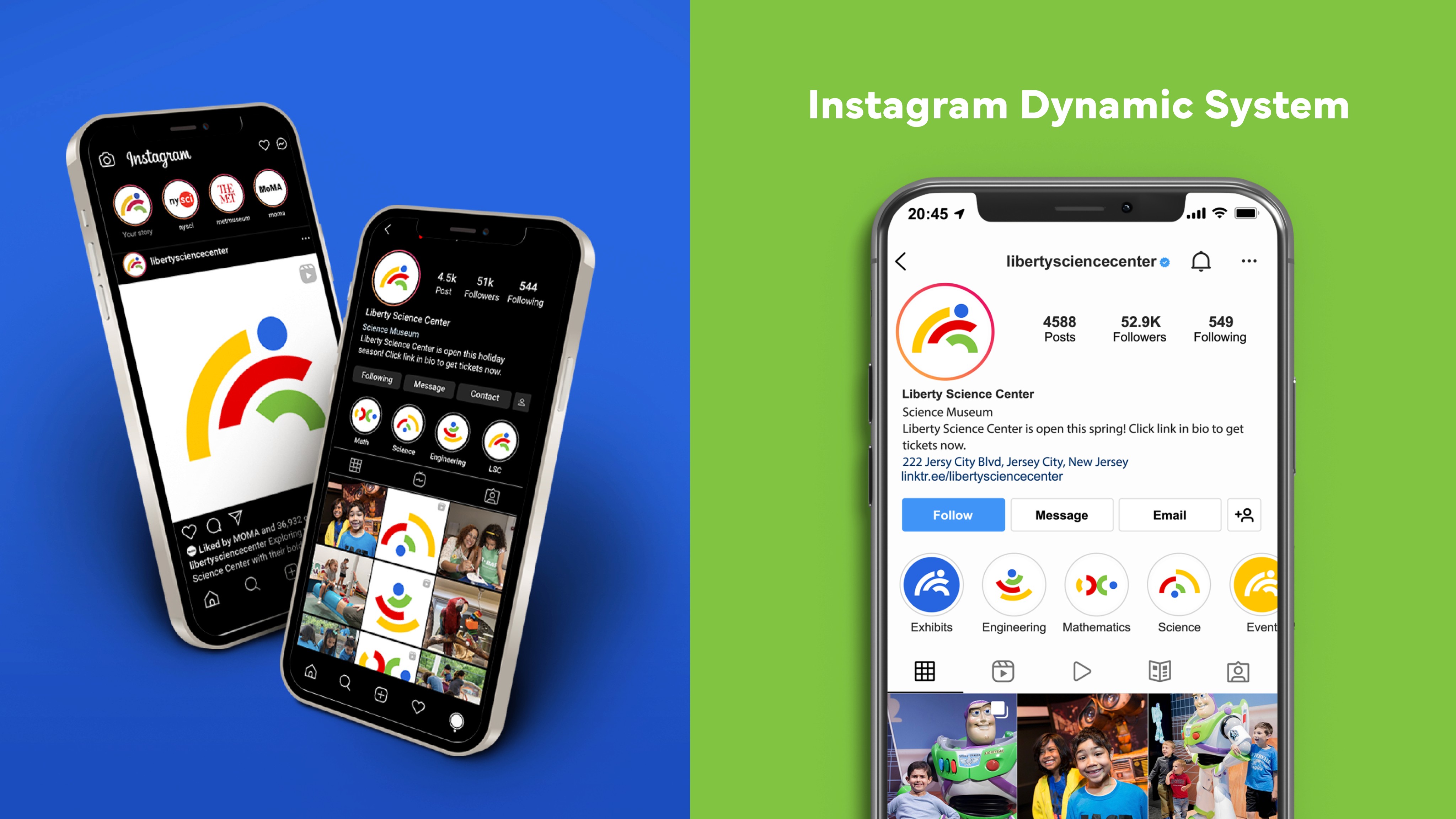
Dynamic System
*Liberty Science Center has three sectors primarily focusing on STEM, there are 3 specific design systems with their own symbols and logo format.
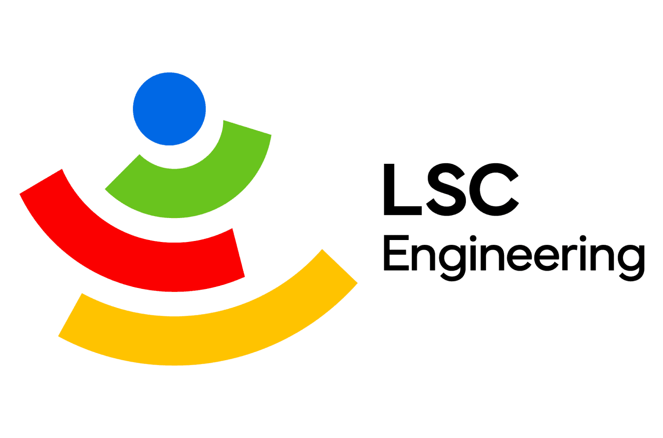
Engineering
Designed to highlight balance and the harmony of elements in engineering.
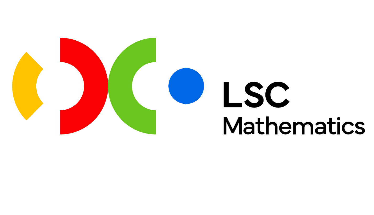
Mathematics
Designed around mathematical symbols: Addition (+), Subtraction (-), Multiplication (×), and Division (÷).
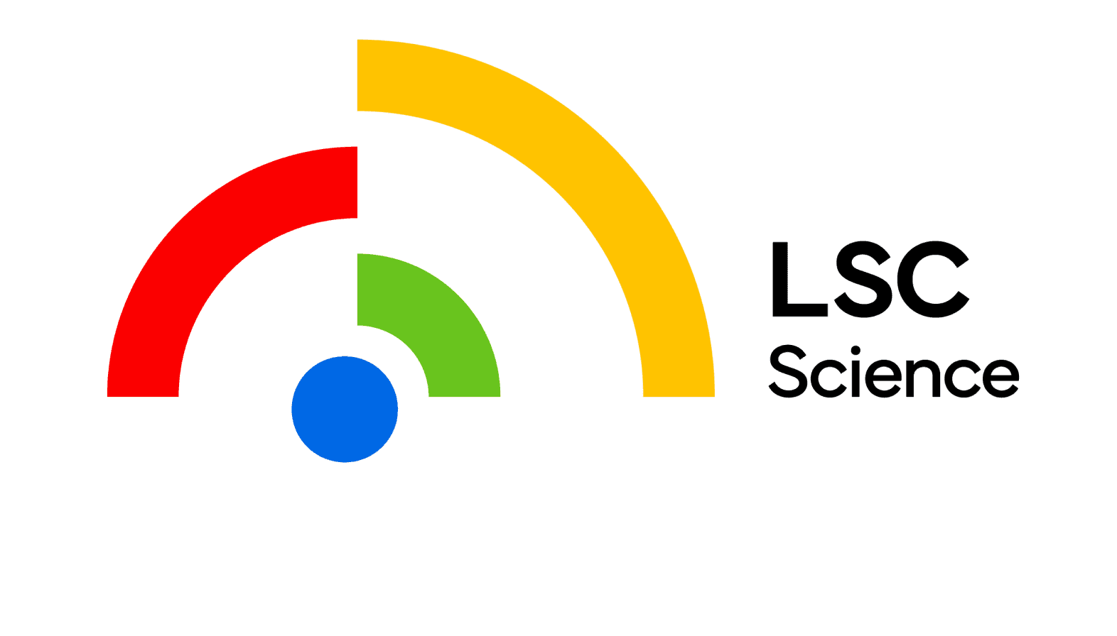
Science
nspired by dynamic orbital patterns and atomic ring structures in scientific visuals.
Dynamic Color System
Solar Yellow
#FFC700
R 255
G 193
B 5
Eco Green
#80C342
R 131
G 183
B 83
Rocket Red
#E60000
R 208
G 36
B 74
Cosmos Blue
#2866DE
R 36
G 86
B 183
Mundial
Aa
Aa
ABCDEFGHIJKLMNOÖPQRSTUVWXYZ
abcdefghijklmnopqrstuvwxyzåäæñöøé
1234567890 +-×÷±=≠≈<>≤≥
@#$%&*{}[]()!?.:;,“”~-–—
DEMIBOLD, 45
LIGHT, 45
ABCDEFGHIJKLMNOÖPQRSTUVWXYZ
abcdefghijklmnopqrstuvwxyzåäæñöøé
1234567890 +-×÷±=≠≈<>≤≥
@#$%&*{}[]()!?.:;,“”~-–—
Brand Identity
Takeaways
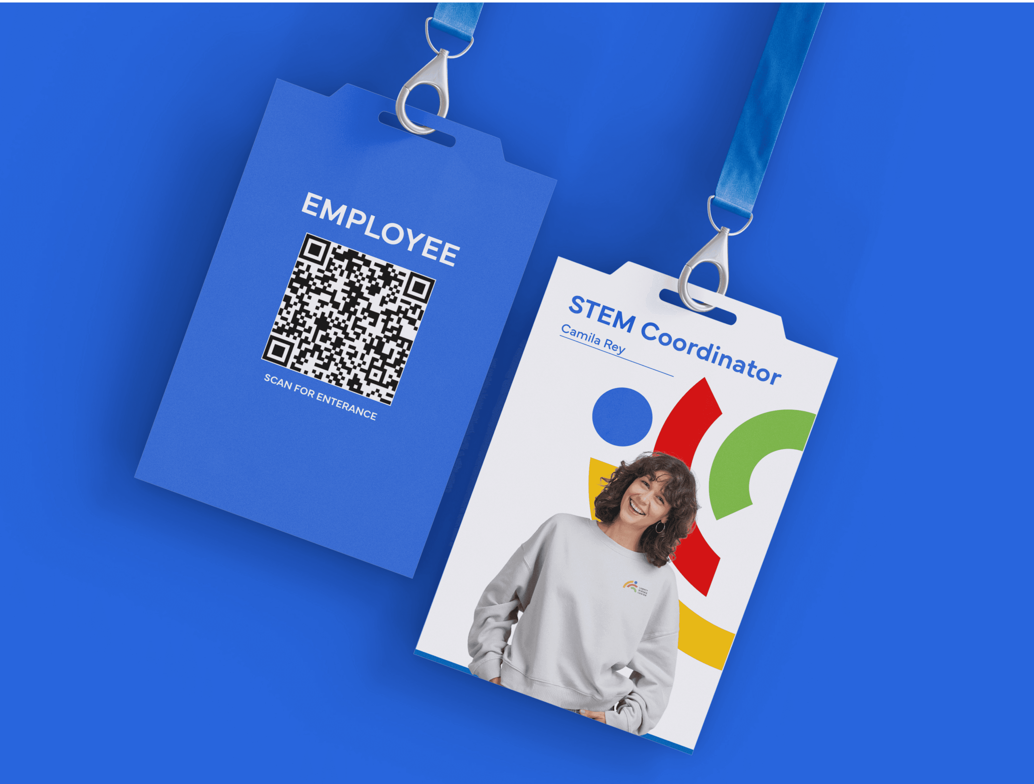
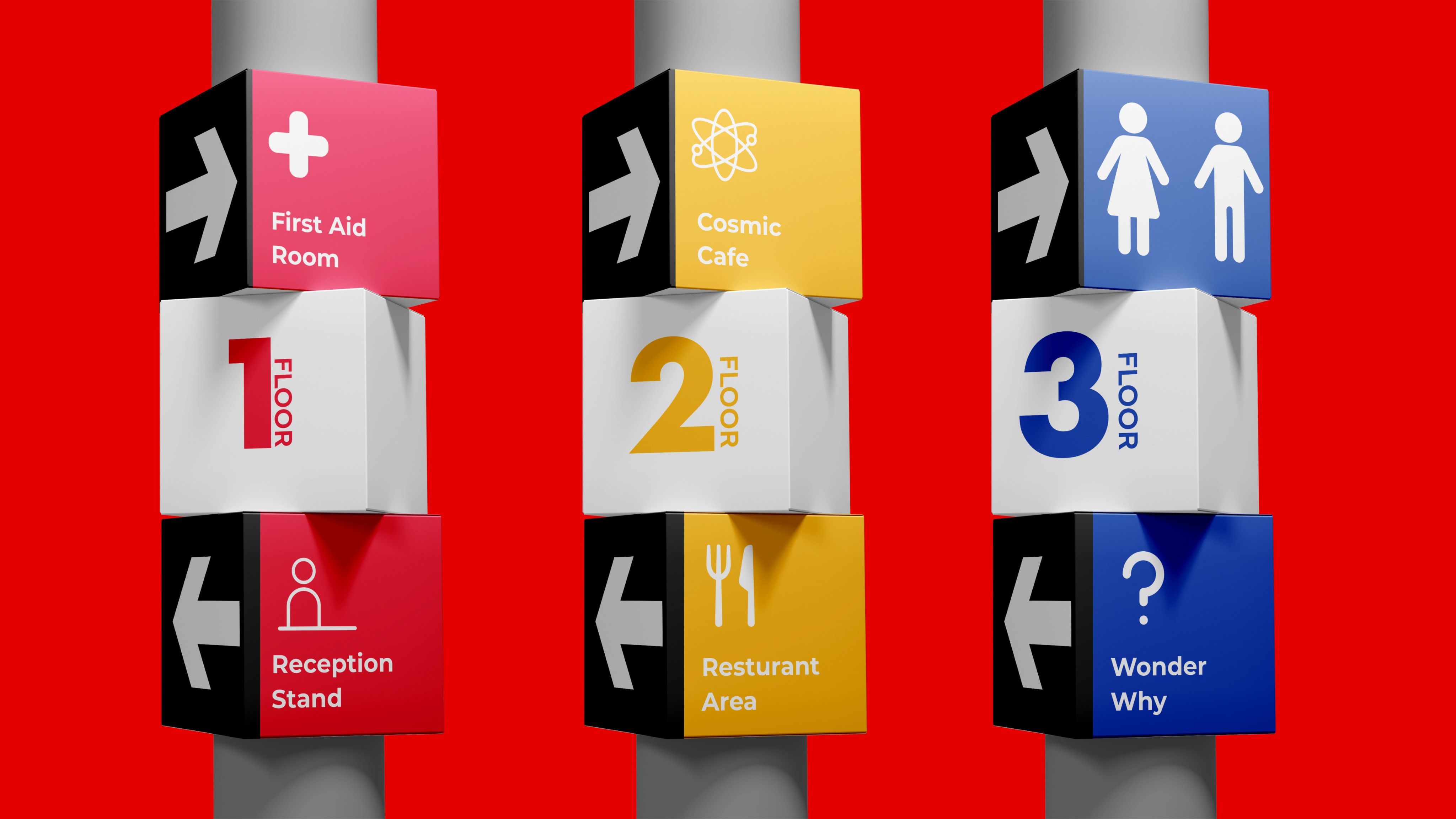
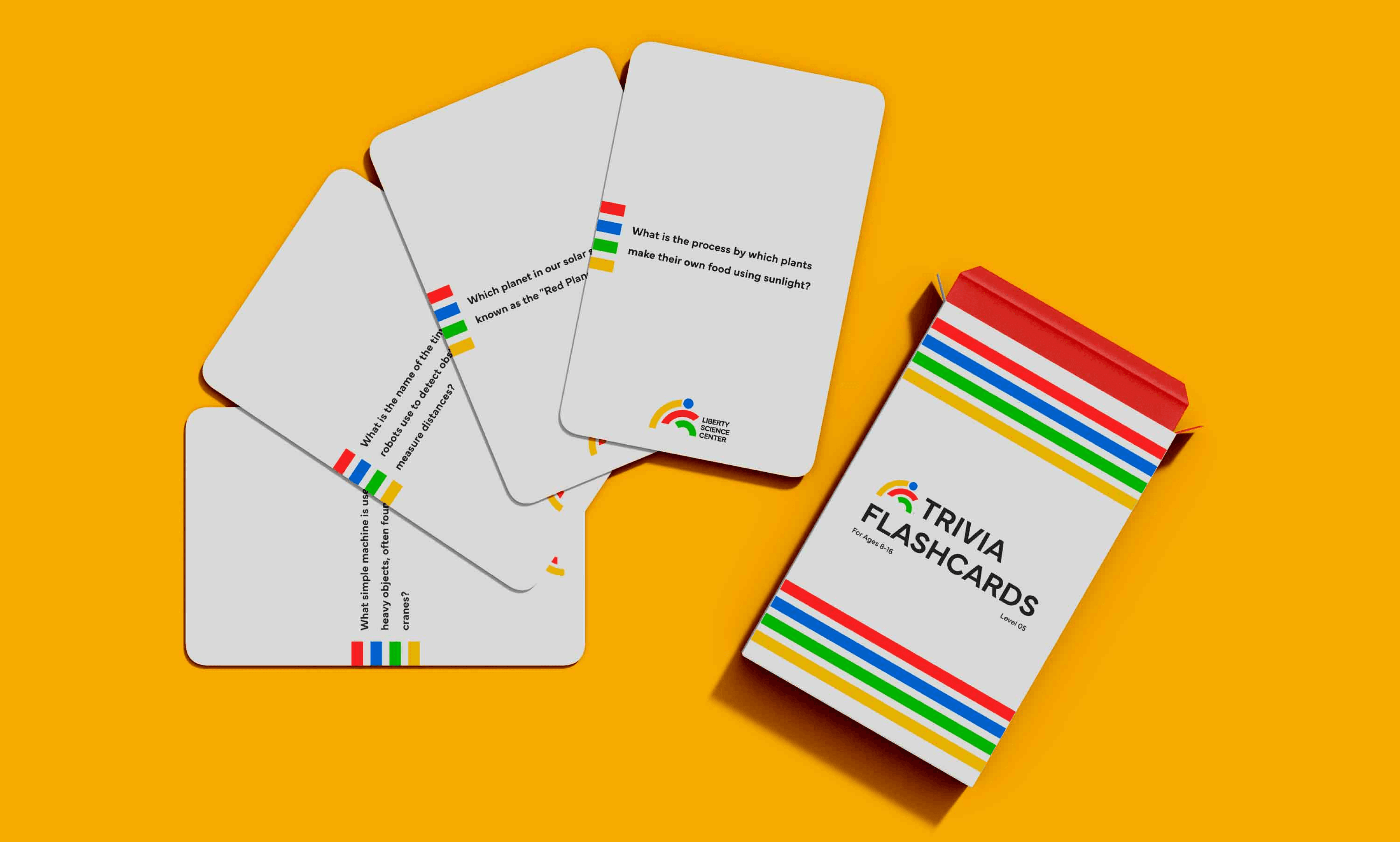
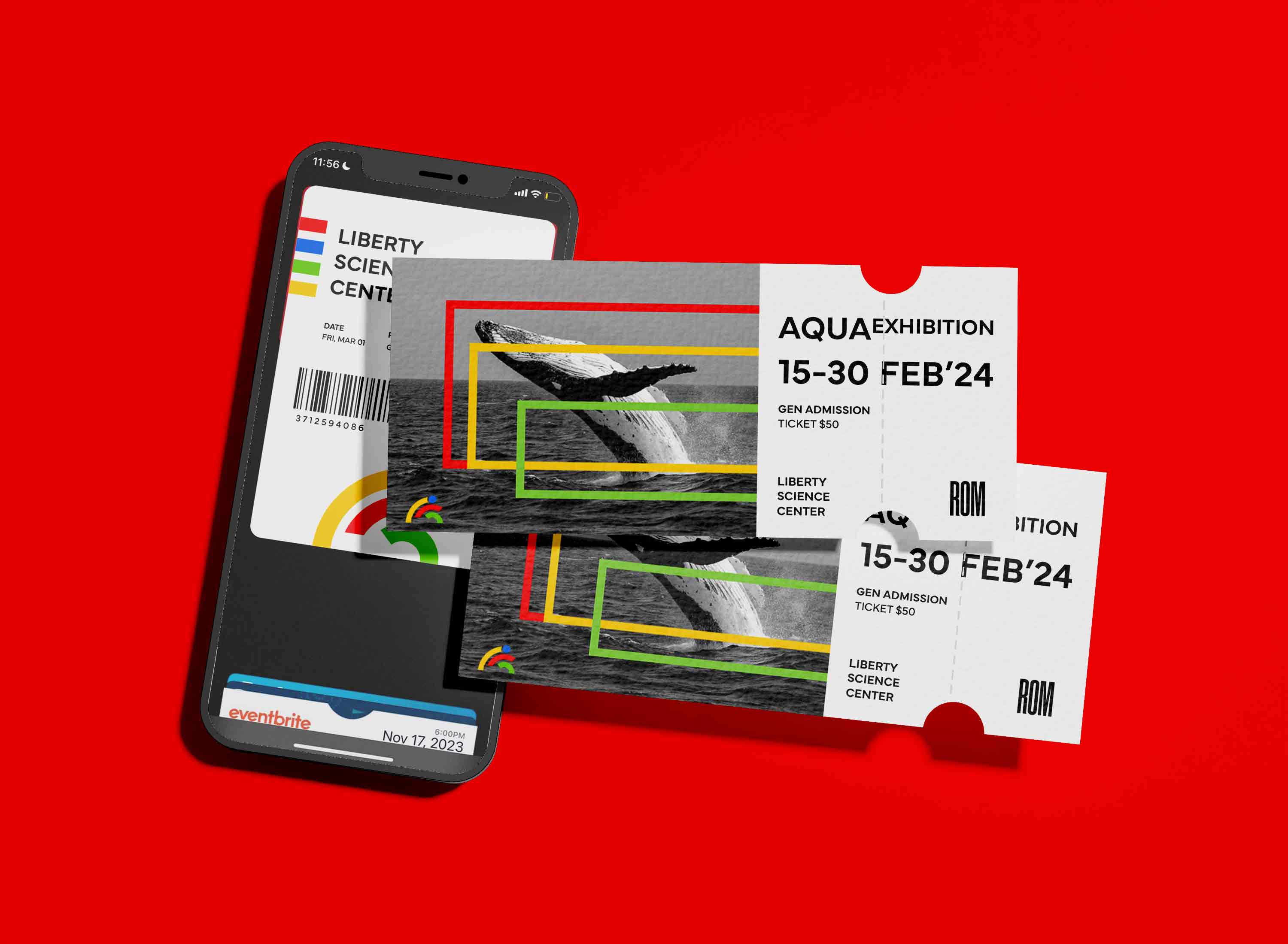
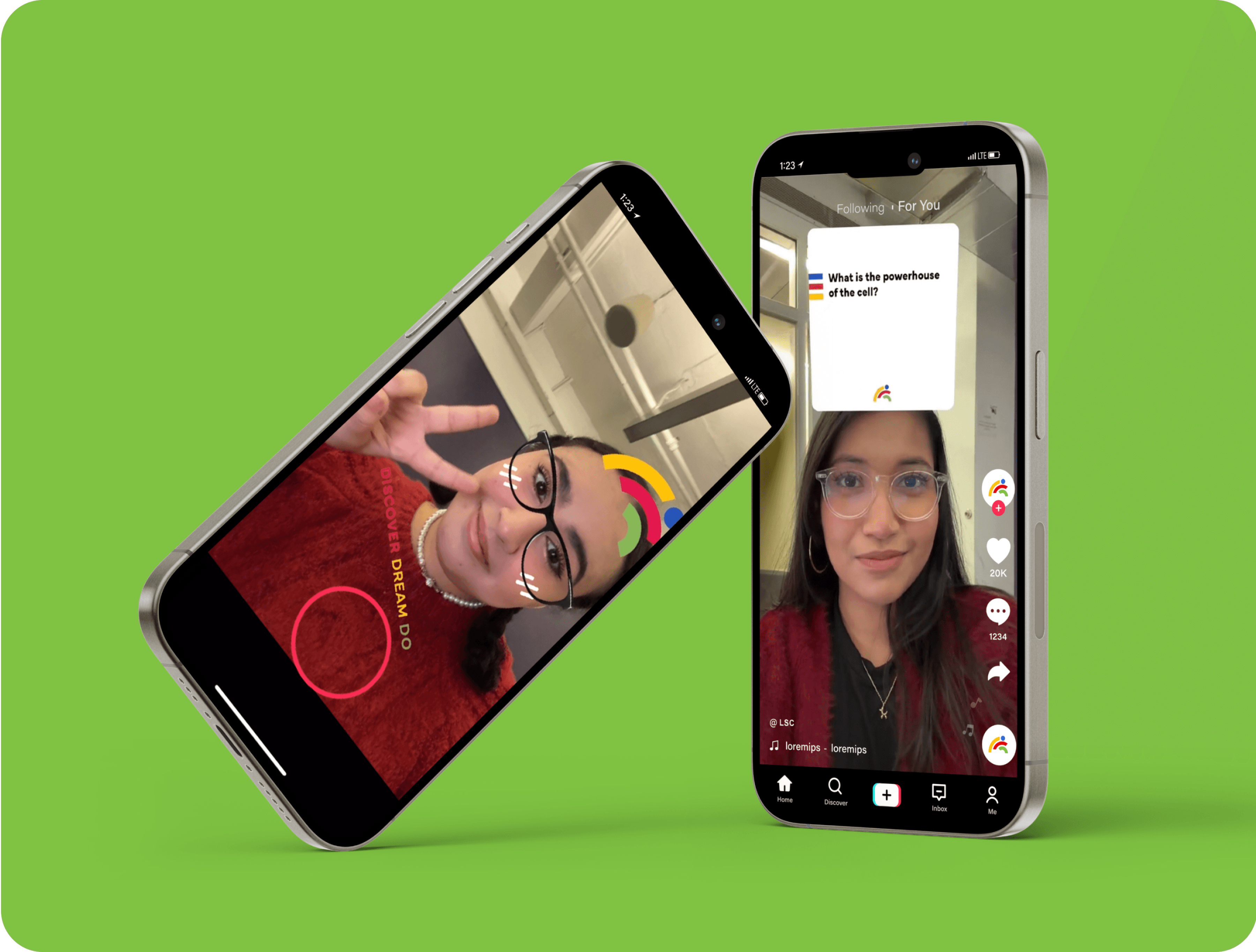
The rebrand attracts a wider audience. Users feel a deeper connection through a versatile identity that shines across digital, signage, and events.
Outcomes
The rebranding revitalized Liberty Science Center’s image, making it more modern and appealing. Visitors now experience a cohesive identity that captures the excitement and accessibility of science, resonating across digital and physical touchpoints.
Reflection
Expand the visual identity across touchpoints. Maintain consistent design to unify physical and digital brand experiences.
Next Steps
